Covid-Airports Data Visualisation
An interactive data visualisation tool, demonstrating the correlation between US Covid 19 cases and airport traffic
Grade - 1st (100%)
Source
The Covid-Airports data visualisation is an interactive data visualisation tool that attempts to convey the correlation between Covid 19 cases and airport traffic in the United States.
It was developed in Python with a Python notebook, using tools to assist with data visualisation tasks such as Pandas, a data analysis library, for data manipulation and Vega-Altair, a declarative visualization library for Python. The visualisation features a combination of 3 linked “graphs“ or “views” working concert to communicate different aspects of the various datasets involved.
I completed this project collaboratively as part a of a three person team, taking on a coordination/orginsational role making the majority of desicions regarding the direction of the work and task delegation while developing my own contribution.
The team spent ~3 weeks planning, designing and creating the interactive visualisation according to core data visualisation principles and we achieved a final assessment result of 100%.
Features
A choropleth map using luminence to display covid cases.
A symbol map layered on top to display airports and their route count.
A vertical ordered bar chart displaying routes per airport of a selected state.
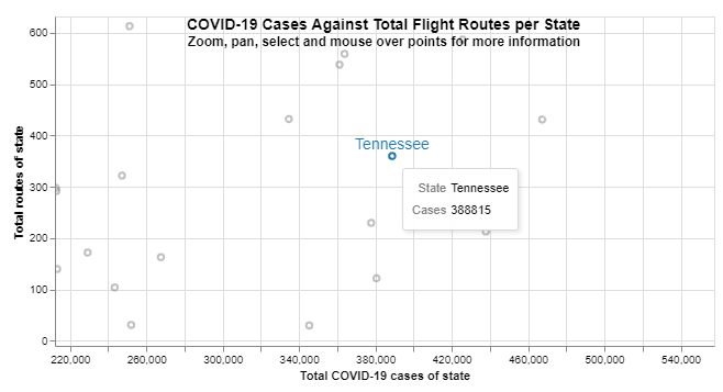
A scatter plot to show Covid cases against total airport routes for each state.
The ability to select and highlight a state on the map or scatterplot which updates the other views.
The ability to select an airport in the bar chart to highlight it in other views.
Tooltips when hovering over any data element with the mouse.
Panning and zooming in the scatterplot.


